Anecdotes from my art journey and painting tipsI started taking painting seriously in 2017 and have consulted thousands of resources to find what works best for me. Here I share what I have learned.
|
The only warm red that works for me plus >20 other great colors!  21 colors that I mix with each other and use for almost all my paintings. The wells are never clean. :) 21 colors that I mix with each other and use for almost all my paintings. The wells are never clean. :) After buying and trying hundreds of colors, I found a palette that works extremely well for me and that I almost always use. I can paint anything I want with these pigments and I especially enjoy that they mix very well with each other without creating mud. Read on as I share the colors and some of my favourite mixes. Maybe you find a pigment on the list that would make a good addition to your own palette! First row: yellows, reds and purples Pure Yellow by Schmincke - A solid, medium cool yellow. Mixes beautifully with other colors such as pink. On rare occasions I feel I need a cooler hue like lemon yellow. Chromium Yellow Hue Deep by Schmincke. To me it looks exactly the same as Indian yellow (which is also gorgeous!). After a lot of experimenting I noticed that Chromium yellow moves around more in wet washes which is something I enjoy in wet washes. My favourite mix is with geranium red to create a gorgeous orange. Geranium Red by Schmincke. The only warm red pigment that really works for me! And I have tried many. :) It is lovely and deep on its own and mixes especially beautifully with chromium yellow deep or Quinacridone Magenta. Quinacridone Coral by Daniel Smith. A very beautiful color. I could probably mix a similar hue with the other colors on this palette but still feel it's worth having this one. Favourite mix: Quin coral + cobalt turquoise. Quinacridone Magenta by Qor. I find it a great challenge to find a vibrant and lightfast pink. I also love to use Opera Rose but even if lightfastness is not my main concern, I sometimes find opera to be too fugitive. Quin Magenta by Qor is the closest to vibrant yet lightfast I have found so far. Like all QoR colors, it moves around like crazy in wet washes, which makes it super fun to use! Perylene Violet by Schmincke. An absolute favorite of mine that I almost always use when I mix dark colors. It mixes especially nicely with perylene green which I also find to be indispensable. Dioxazine Purple by Sennelier. An absolute must have in my eyes. I don't think anyone who tried mixing it with a blue will ever want to not have this color on their palette. It is not known for being especially light fast but I have read articles by different people who say it withstood extensive testing. Second row: blues, greens and a very special ochre Ultramarine Blue by Daniel Smith. I bought this color to replace Ultramarine finest by Schmincke which is also lovely but with a very low tinting strenght. This vibrant pigment is such a useful color for bird paintings and to create green and brown mixes. Phthalo Blue by Schmincke. Also a must have, especially to paint vibrantly colored birds. When I started painting with my first watercolor set that only included ultramarine, I was missing a strong blue and bought a phthalo blue that I since wouldn't want to miss anymore. Cobalt Turquoise by Schmincke. This was one of the first colors I owned. I think it would be impossible to mix this hue from other pigments which is the main reason I use it. I also enjoy the soft granulation. Phthalo Green by Schmincke. Evil people say this color looks unnatural. :) All those who ever tried to paint a hummingbird will disagree with this. To me it is also the best possible color to mix with browns in order to get lovely "natural" green shades. ;) May Green by Schmincke. A convenience green. I think the best reason to have one of those is to save yellow. It also mixes a fantastic (!) brown with quinacridone magenta. Green Gold by Sennelier. An absolute favorite of mine. I love it for its vibrancy. It mixes the most gorgeous browns when combined with pinks and it is also a good basis to mix other greens. Raw Yellow Ochre by Schmincke. A very very good, transparent, non-granulating ochre color. All of you who find yellow ochre to be muddy in mixes should try this color! I discovered it thanks to Hazel Soan's useful tutorials.  Creating a mixing chart is a great way to explore all the beautiful color mixes. Last row: neutrals and specialty colors!
Quinacridone Gold by Daniel Smith. I have mixed feelings towards this color. I'm not an extreme fan of it despite its popularity. The main reason I have it is because it mixes an amazing dark green with perylene green. I also find that a transparent glaze of this color can really add a beautiful glow e.g. to a brown area that needs something extra. :) Transparent Red Oxide by Rembrandt. My attention was brought to this pigment by Steve Mitchell from The Mind of Watercolor. A burnt siena would probably work similarly well but I really enjoy the transparency and soft granulation of this color. Potters Pink by Schmincke. I once added this because I wanted to try something new and I thought including it on my everyday palette would increase the chance that I would use it. It was really the case and I would not want to miss this beautiful pink. Unlike other granulating colors I think this one is quite a good mixing color. It is especially stunning with ultramarine blue. Green Umber by Schmincke. This one is the latest new addition. Finding good browns is a challenge, especially to those who (like me) don't like opaque granulating colors all that much. As I found the stunningly beautiful raw umber by Daniel Smith too muddy in mixes, I replaced it with green umber which (even if I find it a bit less pretty) performs better in mixes. Perylene Green by Schmincke. A most essential color for me. In 90% of my paintings, the mix of perylene green and perylene violet is a starting point to mix darks. If I ever use up a half pan (which has never happened yet because I own so many colors) this one will be first. Payne's Grey by Winsor and Newton. My main use for it is to darken my neutrals or to create neutral darks with geranium red or transparent red oxide. Versions of this color by other brands I have tried are very similar. Buff Titanium by Daniel Smith. I mainly included this color because I wanted to explore it. I often include it when I want to add a bit of "substance" to my light mixes or on its own when I need a very light brown color. It can also be added as an opaque light color similar to white gouache. Useful additions and final thoughts As I said, I feel I can mix any color I need with this palette which I use mainly for birds. The one thing it is lacking is cool yellow. This can be partly resolved by using transparent layers of pure yellow but still sometimes I reach for Lemon Yellow by Daniel Smith which is my favourite cool yellow. When I paint mammals, I often reach for my large 48 color palette, simply because it contains a lot of neutrals which makes painting brown animals more convenient. Links are Jackson's Art supply affiliate links. If you purchase a product after clicking on these, I will earn a small commission at no additional cost for you. I am curious to hear your thoughts! Did you discover any interesting colors here? And do you perhaps have a suggestion on what color to replace may green or quinacridone gold with? Let me know if there is anything you would like me to write about.
0 Comments
Making timelapse painting videos is so much fun and so much work! I am hoping to make new ones one day. Until that day comes, here is one of my older ones. Feel free to check out my humble youtube channel for another one of those featuring a green hummingbird. 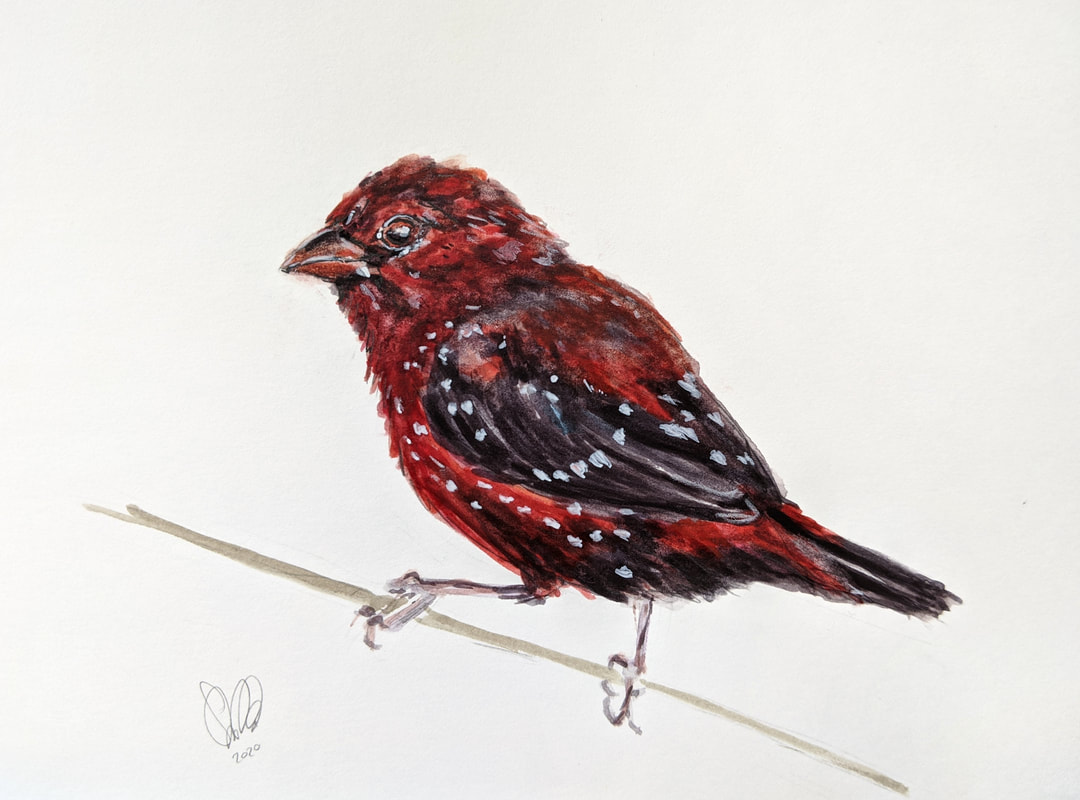 If there is one thing that I don't particularly enjoy, it is patterns - especially regular ones. Part of the reason certainly is the fact that they intimidate me and also it seems like a lot of work to me.
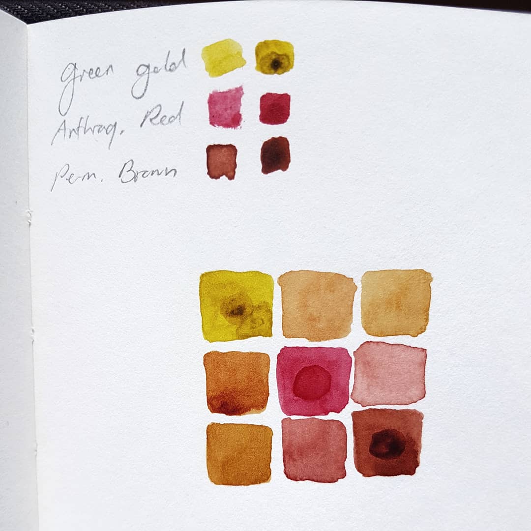
When I painted this crimson finch, I decided to put a bit more effort into painting the white dots on the wings and body. I have been experimenting a bit more with opaque colours such as gouache and I really enjoy the fact that they add dimension and depth to watercolour paintings when used in moderate amounts. For this piece, I used a new liquid opaque white by Schmincke's Aqua Drop line. This product is quite convenient as it already has an ideal consistency to add directly from the bottle. To make things a bit less intimidating, I first added some white pencil marks in the places where I wanted to add the dots. I don't have a lot of experience with adding colored pencil on top of watercolors but as far as I can tell, it does not always work equally well. Either way, the white Luminance Pencil by Caran d' Ache was ideal to put down some transparent whiteness before adding the opaque watercolour. This is the second crimson finch I painted. The main colour I used for it is one of many of my underused ones: Anthraquinoid Red by Daniel Smith which is as beautiful and deep as its blue cousin (also known as Idanthrene blue). The other colours that went into this painting are also underused: Jane's Grey, Pyrrole Red and Quinacridone Burnt Orange. All of those are useful but I feel I could also live without them. Do you have a favourite way of adding opaque white? Or do you prefer saving the white of the papers? Drop me a comment if you like. :) I recently moved flats which made me go through all my belongings including my art supply collection. I think this inspired me to use some paints I normally don't reach for, namely Anthraquinoid Red (PR177) and Permanent Brown (PBr25)- two beauties by Daniel Smith. Mixing those two with one of my favourite mixing colors- Brown Green (PY129) by Sennelier (the Daniel Smith version of this is green gold)- yields some beautiful browns. Apart from those three colors I also used Ultramarine and Dioxazine purple. As I failed to preserve the whites I added some Buff Titanium (PW6:1) which is not something I usually do (I'd normally use white gouache or gelly rolls for this purpose). Do you have a favourite mixing color? And are there any colors you find very beautiful but don't use very often? Let me know in the comments. :)
Some links are Jackson's Art supply affiliate links. If you purchase a product after clicking on these links, I will earn a small commission at no additional cost for you.
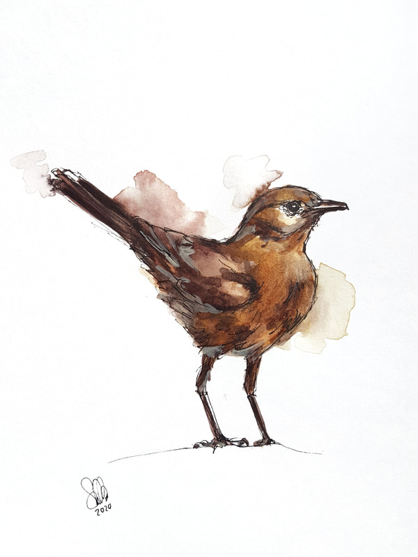
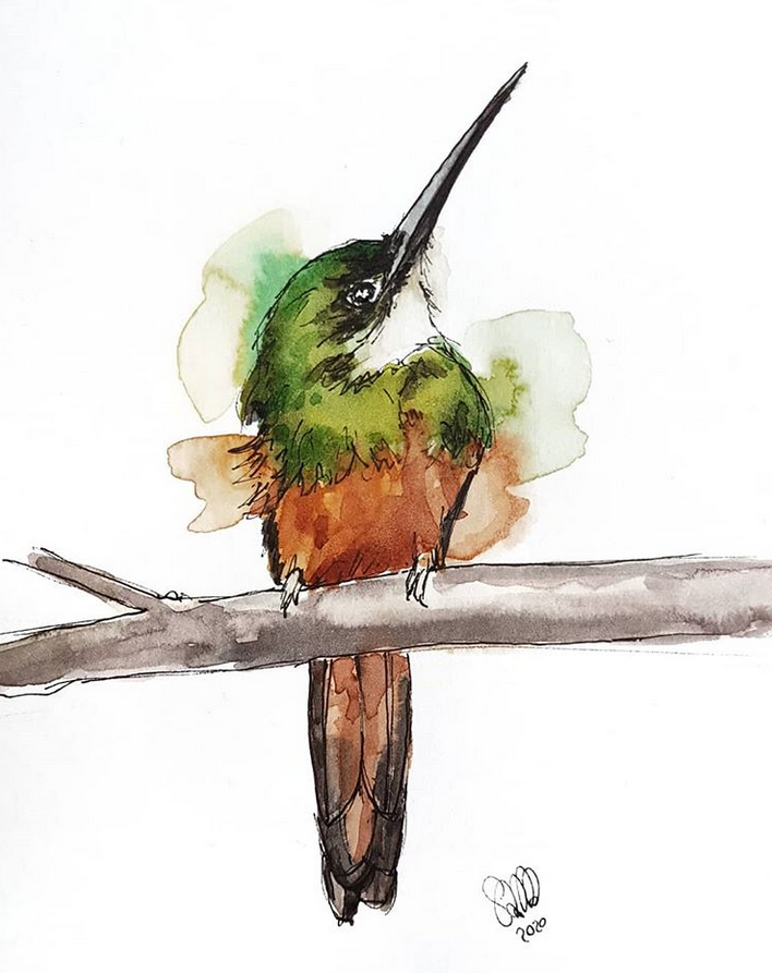
The bird I painted is a brown rockchat. Reference: Flickr Most often I find the birds I want to paint through browsing unsplash and similar sites for freely available reference photos. When I'm lucky, the photographers include the name of the bird species in the description. When they don't, I usually find out the species by searching the internet (extremely tedious) or by asking people on instagram (invaluably helpful!!). When I painted this green bird, I mistook it for a hummingbird and browsed all sorts of hummingbird pages, until I found out - thanks to a comment on my instagram post - that this bird is actually a rufous-tailed jacamar which as I learned is a common bird in Trinidad and Tobago. The eighteen currently recognized species of Jacamar (Galbulidae family) are native to Central and South America. They are in fact more closely related to woodpeckers than hummingbirds! Many of them are extremely beautiful and I am sure I'm going to paint more of them. If you're curious, have a look at the reference photo by Carmem Arquelau. Only in hindsight I noticed she actually included the bird species in the description!
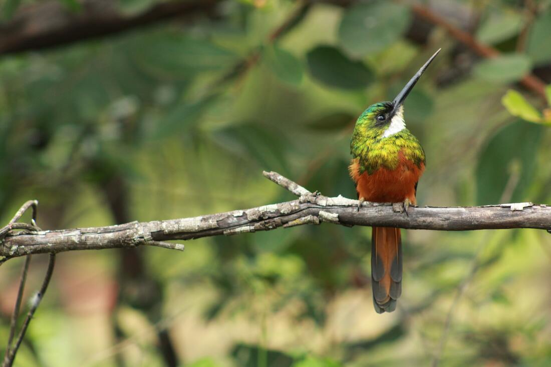 The reference photo by Carmem Arquelau on unsplash |
Author
Simona Mandra Archives
November 2021
Categories |
 RSS Feed
